Have you ever encountered a design that feels effortlessly beautiful, even with its rough edges and faded textures? That’s the charm of Wabi-Sabi, a Japanese aesthetic that embraces imperfection, simplicity, and the beauty of aging. In a world filled with polished, digital perfection, Wabi-Sabi stands out by celebrating the raw and the natural.
In this article, you’ll see real examples of Wabi-Sabi in visual design, from graphic and web design to interiors and photography. Plus, you’ll learn how to bring this timeless style into your creative work.
Wabi-Sabi Philosophy: What It Means and Why It Matters
Wabi-Sabi is deeply rooted in Japanese culture and is influenced by Zen Buddhism and traditional tea ceremonies. It emerged as a way to appreciate simplicity, natural imperfections, and the beauty of aging. Unlike modern aesthetics that chase flawlessness, Wabi-Sabi finds meaning in the raw, unfinished, and transient aspects of life.
Key Principles of Wabi-Sabi
- Imperfection: Instead of striving for precision, Wabi-Sabi values the beauty found in flaws. Cracks in pottery, uneven brushstrokes in art, and weathered textures in furniture are all celebrated. These “flaws” add uniqueness and character, making each piece special.
- Impermanence: Nothing lasts forever—colors fade, wood ages, and metals rust. Wabi-Sabi embraces this natural aging process, seeing it as an essential part of beauty rather than something to be fixed or hidden. It reminds us to appreciate things in their present state before they change.
- Incompleteness: Perfection is an illusion and true beauty lies in the unfinished. In design, this can mean embracing negative space, asymmetry, or an open-ended creative process. Wabi-Sabi teaches that something doesn’t need to be completely refined to be visually or emotionally impactful.
How Wabi-Sabi Contrasts with Modern Perfectionism
Modern design often focuses on sleek, symmetrical, and flawless aesthetics, aiming for perfection through technology and precision. Wabi-Sabi, on the other hand, rejects this pursuit of perfection and instead celebrates organic, handmade, and naturally evolving designs. While modern perfectionism seeks to control and predictability, Wabi-Sabi embraces unpredictability, allowing imperfections to tell a story and add depth to the visual experience.
Examples of Wabi-Sabi in Different Design Fields

Wabi-Sabi influences various design fields, creating visuals that feel natural, imperfect, and deeply human. Instead of polished perfection, it embraces raw textures, organic forms, and a sense of history. Here’s how Wabi-Sabi is applied in different areas of design:
Graphic Design
In graphic design, Wabi-Sabi is all about texture and authenticity. Designers often use rough, textured backgrounds that resemble handmade paper, fabric, or aged surfaces. Brush strokes and hand-drawn elements replace clean digital lines, adding a sense of craftsmanship. Instead of sleek vector illustrations, Wabi-Sabi inspired designs might include watercolor splashes, ink blots, or faded textures that give a sense of imperfection and warmth.
Web Design
Wabi-Sabi web design moves away from rigid, symmetrical layouts and embraces organic structures. Uneven grids, asymmetrical elements, and imperfect shapes create a more natural browsing experience. Instead of sharp, high-contrast colors, websites in this style often use muted, earthy tones like browns, grays, and warm neutrals. Typography choices also lean toward hand-drawn or distressed fonts, reinforcing the handmade and authentic feel.
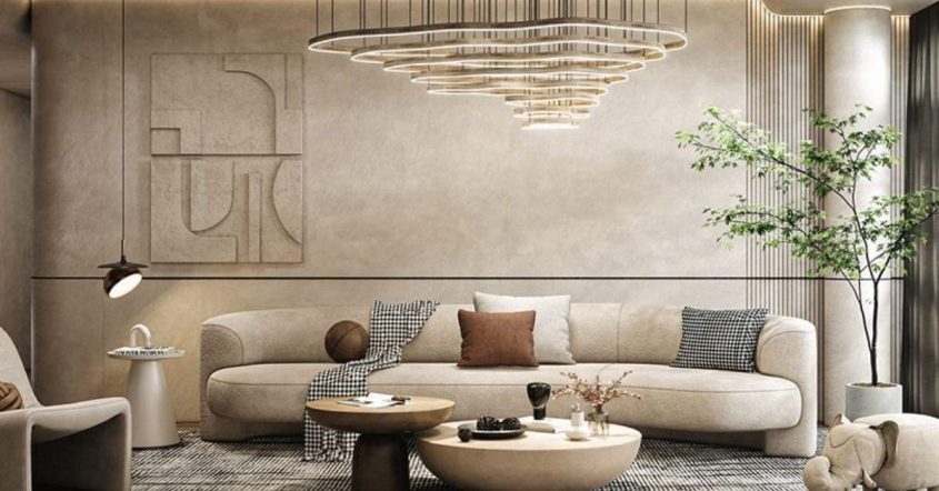
Interior Design
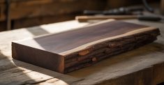
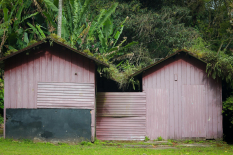
In interior design, Wabi-Sabi thrives through the use of aged materials and rustic textures. Furniture made from reclaimed wood, handmade ceramics with irregular shapes, and fabrics that show natural wear all contribute to a cozy, lived-in feel. Rather than hiding flaws, Wabi-Sabi interiors celebrate them—visible wood grain, chipped paint, and uneven surfaces add character and history. Natural light, minimal decor, and simple yet meaningful objects create a calming and uncluttered space.
Photography
Wabi-Sabi photography captures the beauty of the imperfect and fleeting moments. Instead of aiming for sharp, flawless images, this style embraces soft lighting, grainy textures, and candid shots. A slightly blurred photo, a naturally faded color palette, or a composition that feels unbalanced can evoke a deeper emotional connection. It focuses on real-life moments, highlighting simplicity, nostalgia, and authenticity over staged perfection.
Typography
Typography in the Wabi-Sabi style often features uneven letterforms and distressed fonts. Handwritten scripts, imperfect calligraphy, and typefaces with slight variations in thickness and spacing reflect a human touch. Instead of clean, geometric fonts, designers opt for text that feels organic—perhaps ink-smudged, weathered, or slightly eroded over time. This creates a raw, natural aesthetic that aligns with the philosophy of Wabi-Sabi.
Applying Wabi-Sabi principles in these design fields, creators bring warmth, personality, and authenticity to their work. It’s a reminder that beauty doesn’t come from perfection but from the unique and imperfect details that make something feel real.
Wabi-Sabi in Visual Design: Core Characteristics
Wabi-Sabi design embraces simplicity, imperfection, and natural beauty, creating visuals that feel warm, organic, and authentic. Unlike modern minimalism, which can sometimes feel cold and sterile, Wabi-Sabi minimalism is inviting. It removes unnecessary elements while keeping details that add characters, such as aged textures, raw materials, and handcrafted touches. This approach makes designs feel more human and emotionally engaging.
Natural textures play a big role in Wabi-Sabi aesthetics. Instead of polished and flawless surfaces, it highlights materials like rough wood, unpolished stone, crumpled paper, and weathered metal. These textures add depth and uniqueness, making the design feel more grounded and connected to nature. The color palette also follows this principle, favoring soft, earthy tones such as muted greens, warm browns, faded grays, and sandy beiges. These colors create a calming and timeless atmosphere, avoiding the artificial brightness often seen in modern design.
Another key aspect of Wabi-Sabi is its embrace of asymmetry and irregularity. Unlike traditional designs that aim for perfect balance and alignment, Wabi-Sabi welcomes uneven spacing, organic shapes, and unpredictable forms. This creates a sense of natural beauty, similar to how things appear in nature—imperfect yet harmonious. Handcrafted and weathered elements further enhance this aesthetic. Designs that showcase visible brushstrokes, rough edges, or faded prints carry a sense of history and uniqueness, making them feel more authentic.
By incorporating these elements, Wabi-Sabi’s visual design offers a refreshing alternative to modern, perfection-driven aesthetics. It reminds us that beauty isn’t found in flawless precision but in the raw, imperfect, and deeply human aspects of design.
How to Apply Wabi-Sabi in Visual Design
Wabi-Sabi isn’t just a design trend—it’s a mindset that values imperfection, simplicity, and authenticity. Instead of chasing polished perfection, this approach embraces natural textures, organic forms, and raw beauty. Here’s how you can bring Wabi-Sabi into your visual design:
Use Authentic and Unpolished Elements
Wabi-Sabi design favors real, unprocessed materials over artificial perfection. This means using rough textures, aged surfaces, and handcrafted details that bring a natural feel to your work. In graphic design, this could be rough paper textures or brush strokes. In web design, it might be asymmetrical layouts and hand-drawn icons. The goal is to create a design that feels human rather than machine-made.
Avoid Excessive Retouching and Artificial Perfection
In today’s digital world, everything is often over-edited to look flawless. Wabi-Sabi challenges this by allowing imperfections to remain. Instead of smoothing out every wrinkle in a photo or making every design element perfectly symmetrical, embrace the flaws. A slightly faded image, a hand-sketched line, or an uneven texture can add character and make the design feel more natural and relatable.
Create a Sense of Depth and Nostalgia with Aged Textures
A key feature of Wabi-Sabi is the feeling of time passing. Using worn-out textures, faded colors, and vintage-inspired elements can add a sense of nostalgia to your design. Think of how an old book cover looks with its worn edges or how a weathered wooden surface tells a story through its cracks and scratches. In visual design, you can apply this through distressed typography, grainy filters, and muted color palettes that mimic the look of age and history.
Let Materials and Imperfections Tell a Story
Every scratch, stain, or crack in an object has a story behind it. Wabi-Sabi embraces these imperfections as part of an object’s journey. In design, this could mean using textures that look naturally aged or elements that aren’t perfectly aligned. Instead of correcting small details, allow them to be part of the final design. This makes the work feel more authentic and emotionally engaging.
Focus on Emotional Connection Rather Than Polished Aesthetics
Wabi-Sabi isn’t about impressing with perfection—it’s about creating emotion and connection. A design that feels raw and organic often resonates more deeply with people than something overly refined. Whether it’s a website, a poster, or a photograph, aim to make the viewer feel something. Use natural color schemes, personal touches like hand-drawn elements, and imperfect textures to create an atmosphere that is warm, calm, and meaningful.
Applying these principles, you can bring Wabi-Sabi into your visual design in a timeless and deeply human way. It’s a reminder that beauty isn’t in flawlessness but in the small, imperfect details that make something unique and real.
The Emotional and Psychological Impact of Wabi-Sabi Design

Wabi-Sabi is more than just a design style—it’s a philosophy that influences how we see beauty, time, and imperfection. This approach to design can have a profound emotional and psychological impact, helping to create a sense of peace, acceptance, and mindfulness. Here’s how Wabi-Sabi design affects our emotions and mindset:
Creating a Sense of Calm and Mindfulness
In a world filled with fast-paced digital content and overwhelming perfectionism, Wabi-Sabi offers a refreshing alternative. Its use of natural materials, muted colors, and simple compositions brings a feeling of stillness and balance. When surrounded by Wabi-Sabi-inspired design—whether in a website, a piece of art, or an interior space—it encourages a slower, more mindful way of experiencing beauty. The imperfections and organic textures invite us to pause and appreciate the present moment rather than rushing toward perfection.
Encouraging Acceptance of Imperfection in Creativity
Many people struggle with the pressure to create flawless work, whether in design, art, or daily life. Wabi-Sabi reminds us that imperfection is not a flaw but a feature of authenticity. A slightly uneven layout, a hand-drawn illustration with rough edges, or a faded texture can add depth and uniqueness to a design. This mindset encourages creative freedom by allowing designers to embrace mistakes and see them as part of the beauty rather than something to correct. It promotes confidence in personal expression, showing that raw, unpolished work can be just as powerful—if not more so—than something perfected to every detail.
Supporting Sustainable and Ethical Design Choices
Wabi-Sabi’s appreciation for natural aging and imperfection aligns closely with sustainability and ethical design. In product design and interiors, it values materials that last over time, such as reclaimed wood, handcrafted objects, and biodegradable materials. Instead of discarding something because it is worn or outdated, Wabi-Sabi encourages repairing, repurposing, and celebrating the natural aging process. In digital design, this could mean choosing organic, hand-drawn elements over mass-produced, generic graphics or favoring simplicity over excessive digital manipulation. This approach helps reduce waste, promotes responsible consumption, and encourages a deeper connection with the things we create and use.
By embracing Wabi-Sabi in design, we move away from the pressure of perfection and toward a more peaceful, accepting, and sustainable way of creating and experiencing beauty. It reminds us that real beauty isn’t about flawlessness—it’s about authenticity, history, and the emotions that imperfections bring to life.
Read Also…How to Organize Your Kitchen Cabinets
Conclusion
Wabi-Sabi’s appeal in visual design goes beyond trends—it’s a timeless philosophy that continues to inspire creativity. By embracing imperfection, simplicity, and natural beauty, designers can create work that feels more authentic, meaningful, and emotionally engaging. In a world that often prioritizes polished perfection, Wabi-Sabi offers a refreshing approach that values raw textures, organic forms, and the beauty of aging materials.
For designers, adopting Wabi-Sabi means letting go of the fear of flaws and seeing them as part of the creative process. Whether it’s using hand-drawn elements, asymmetrical layouts, or aged textures, this design style encourages a deeper connection with the work. It reminds us that true beauty isn’t found in flawlessness but in uniqueness, character, and the passage of time.